
A Dismal Report Card on Global Inequality
A Dismal Report Card on Global Inequality
A new report, based on the work of Thomas Piketty and his colleagues, offers a stark picture of the increasing concentration of wealth and income at a global scale.
The global maldistribution of wealth and income is now so stark, we have taken to comparing the incomes or fortunes of just a few individuals to vast swaths of the world’s population. Behind those jaw-dropping ratios, there is a more complex story that plays out across time and across regions.
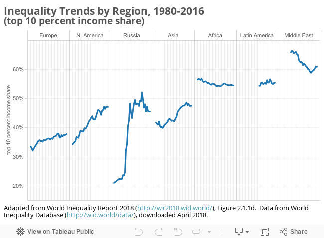
The World Inequality Report 2018 painstakingly documents the dimensions of income and wealth inequality, around the globe, within and across countries. Boiled down to one sentence, the conclusions of the 2018 Report echo those of Branko Milanovic and others: Wealth and income inequality are widening within countries, even as global development slowly narrows the gap between countries. These patterns are evident in the summary of regional trends below. The share of income going to the top 10 percent has increased moderately in Europe; it starts high and stays high in Africa, Latin America, and the Middle East; it has taken off—for different reasons—in the United States, Russia, and Asia.
Their innovative data collection (across time and across settings) relies heavily on fiscal data (that is, from tax returns)—a source that both provides much longer and complete long runs of data (since 1913 in the United States) than the Census or other survey sources, and which captures the concentration of wealth and income at the very top of the distribution in ways the survey data cannot.
The research team is determined to turn more of the conversation to wealth inequality. Not only is wealth inequality much steeper than income inequality in almost all settings (the highest-earning 1 percent in the United States take home 20.2 percent of national income; the richest 1 percent claim 41.8 percent of all wealth), but—in a world where capital income is displacing labor income—it is increasingly the root cause of income inequality as well.
For the United States, that story is now a familiar one—captured by the iconic “suspension bridge” graph of top income shares across the last century. Beyond that, I think there are two findings on U.S. income equality worth underscoring—one historical, and one comparative.
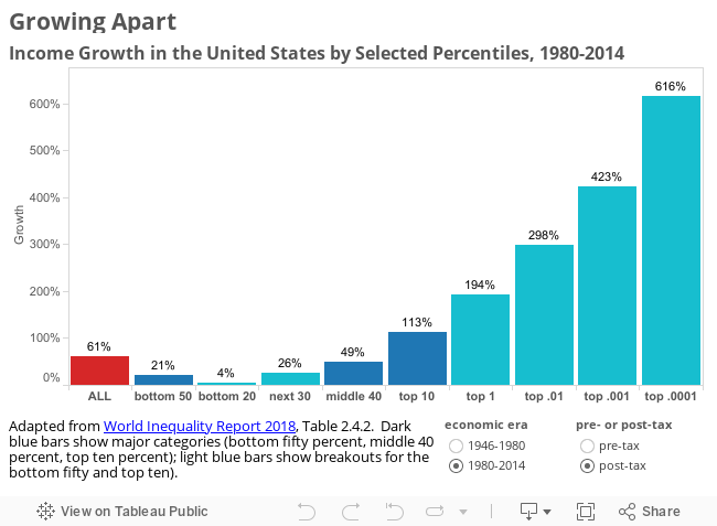
The first graphic below captures trends in income distribution across two eras, 1946–79 and 1980–2014. In the early postwar era, income growth was broadly shared—indeed the bottom 50 percent saw their real incomes grow at nearly twice the rate of the top 10 percent of earners, and income growth for the bottom 20 percent outstripped income growth for the top 0.0001 percent. After 1980, the pattern changed sharply as the policies and institutions that sustained shared growth (union density, labor standards, progressive taxation, social policy) crumbled. Since 1980, the pre-tax earnings of the bottom 20 percent have slipped by 25 percent, while the top 0.0001 percent have seen their incomes grow sixfold.
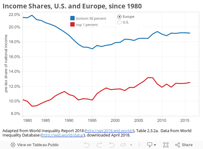
The second graphic contrasts the American pattern, since 1980, with that of its European peers. The measure here is a compelling one, comparing the income share of the top 1 percent with that of the bottom 50 percent. In Europe, growing inequality is evident: the top one percent increase their share from 10 to 12.5 percent of national income, while the bottom 50 percent lose ground, falling from just over 21 percent to just over 19 percent. In the United States, the pattern is much more dramatic. The 1980 share are nearly identical to those in Europe. But in the United States, the top 1 percent share nearly doubles (from 10.7 percent in 1980 to 20.2 percent in 2014) over the next thirty-five years, actually outstripping the bottom 50 percent in the mid-1990s. The bottom half of the distribution, by contrast, sees its share of national income plummet to just over 12 percent.
Colin Gordon is a professor of history at the University of Iowa. He writes widely on the history of American public policy and is the author, most recently, of Growing Apart: A Political History of American Inequality.